A Design Flaw in Cryptocurrency’s Crown Jewel
Bitcoin, the revolutionary digital currency created by the mysterious Satoshi Nakamoto, has a cult following due to its decentralized nature and community spirit. But who hasn’t nibbled at their nails, wondering if the logo itself tells a tale of imperfection? A hidden flaw in the Bitcoin logo, present for over a decade, reminds us that even icons can have blemishes.
The Birth of an Icon: A Brief History
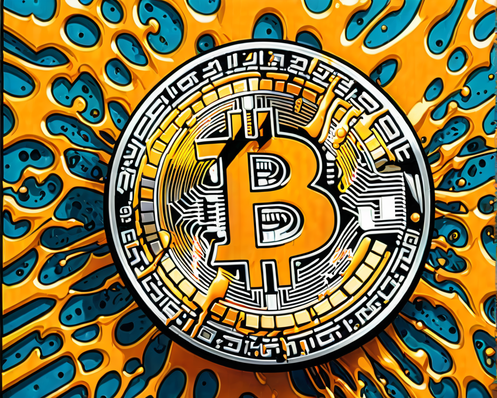
On November 12, 2010, a user named bitboy (not that bitboy you’re thinking of) posted the original vector files of the Bitcoin logo on bitcointalk.org. This logo, with its bold orange circle and sleek white ‘₿’, became synonymous with cryptocurrency. Little did the community know, lurking in the logo’s desperate attempt for perfection was a small—or should we say *imperceptible*—orange line that would become the stuff of memes and Reddit threads.
Zooming In: What We Missed
While the crypto community generally preaches the art of ‘zooming out’ during bear markets, it turns out the original Bitcoin logo begs to differ. By zooming in, devout Bitcoiners can discover an orange line extending into the ‘₿’, making it feel less like a beacon of innovation and more like that uninvited wrinkle in your favorite shirt. If only the logo could pull a fast one and look smoother. Alas, the irony of aiming for perfection in a decentralized world!
Community Reaction: Indifferent Yet Amused
Despite the revelation of this long-hidden flaw, reactions from the Bitcoin community have ranged from amused chuckles to a nonchalant shrug. It appears that the importance lies more in what Bitcoin represents rather than the mere aesthetics of its logo. It’s like discovering your favorite coffee shop uses a slightly warped logo; it doesn’t change the fact that their espresso is divine. But wait, there’s more…
A New Dawn: An Updated Logo?
Enter Twitter user @_Bosch_, who highlighted the flaw and produced an updated logo removing the unsightly mark. Meanwhile, @skyler_fs pointed out yet another curvature issue that doesn’t fit the “smooth operator” criteria. Despite the minor fixes, it seems unlikely that a new logo would gain mainstream acceptance without consensus among Bitcoiners, proving once again that community spirit reigns supreme in the cryptocurrency world.
Bitcoin’s Future: Beyond Logos
As the prices begin to climb back up, Bitcoin enterprises like CleanSpark grow, riding the wave of recovery. CFO Gary Vecchiarelli has expressed ambitions for “explosive growth” through savvy acquisitions. Because in the end, integrity of the logo is nice, but we all know the real treasure is in financial freedom, right?