The Rise of Real-Time Data Visualization
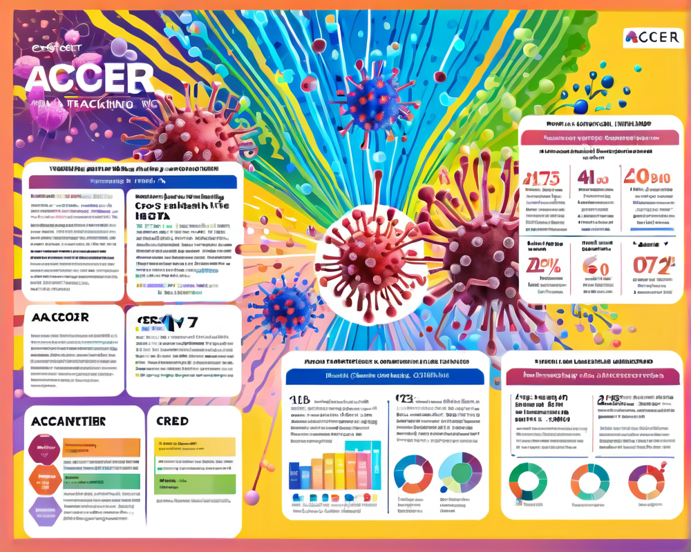
In the age of information, keeping track of the never-ending statistics surrounding the coronavirus is as essential as remembering to wear a mask (or two, we’re not judging). Acoer has whipped up an innovative solution – the HashLog data visualization engine – that uses blockchain technology to make the daunting task of visualizing the spread of COVID-19 a breeze.
Meet the Wizard Behind the Curtain: Jim Nasr
Jim Nasr, Acoer’s CEO, likens the HashLog tool to having an invisibility cloak for virus data. “We pull real-time data from organizations like the CDC and the WHO,” he said. Think of it as a magician’s hat, pulling out relevant, easy-to-read statistics that the public can understand, such as the global case count, recovery rates, and where the virus lurks the most (sorry, no rabbit coming out here!).
Getting Fancy with Data
- Dynamic Dashboards: Users can filter data and make it dance to their whims.
- Downloadable Data: Forget screenshots—download filtered data directly!
- Trends and Insights: The dashboard dives into Google trends and regional interests.
It’s more than just numbers on a screen; it’s a sophisticated tool that transforms data into a comprehensible visual narrative.
Hedera Hashgraph: The Trusty Sidekick
HashLog doesn’t just sit there, twiddling its thumbs. It utilizes Hedera Hashgraph’s distributed ledger technology for real-time tracking. This means that every piece of data is consensually shared and synchronized, making sure we’re not left in a foggy cloud of misinformation. Mance Harmon, Hedera’s CEO, believes that this technology ensures that once something goes into the ledger, it’s essentially cast in stone—roads to reliable corona-stats!
Mirror Nodes: A Peek Behind the Data Curtain
Mance likes to think of mirror nodes as a way to witness history being made. These nodes allow anyone to check back on the data without needing a special invitation to the main party. “It’s like having your very own time machine for transaction history,” he quipped. In essence, users can monitor how information streams in real-time, providing a trustworthy backdrop to our current health crisis.
HashLog vs. The Others: The Showdown
Now, you might be wondering, “What makes HashLog stand out from the crowd?” Well, aside from its sleeker dashboard and groupie-like fanbase from public health officials, it’s all about accessibility. Compared to conventional mapping tools, HashLog’s ability to filter and visualize data makes it the life of the data party.
- Tracks regional distinctions better than the CDC’s work-in-progress county map.
- Allows for more personalization in data collection.
Blockchain’s Compassionate Side
Blockchain isn’t just about all the techy stuff; it’s about supporting those in need, too. Take Hyperchain for example, which launched a platform for tracking medical supply donations in central China. With its traceable and immutable nature, donors can feel secure in knowing where their contributions go—like a high-tech address book for altruism!
The Bottom Line
Acoer’s HashLog demonstrates a significant leap toward not only processing real-time data efficiently but also ensuring that the information we receive during this global health crisis is as accurate as it can be. With tools like these at our side, maybe we can finally stop staring blankly at spreadsheets and instead engage with the virus data in a way that actually makes sense to us, like a great Netflix series—easy to follow and packed with tension!